Image - 2026-05-23 17:31
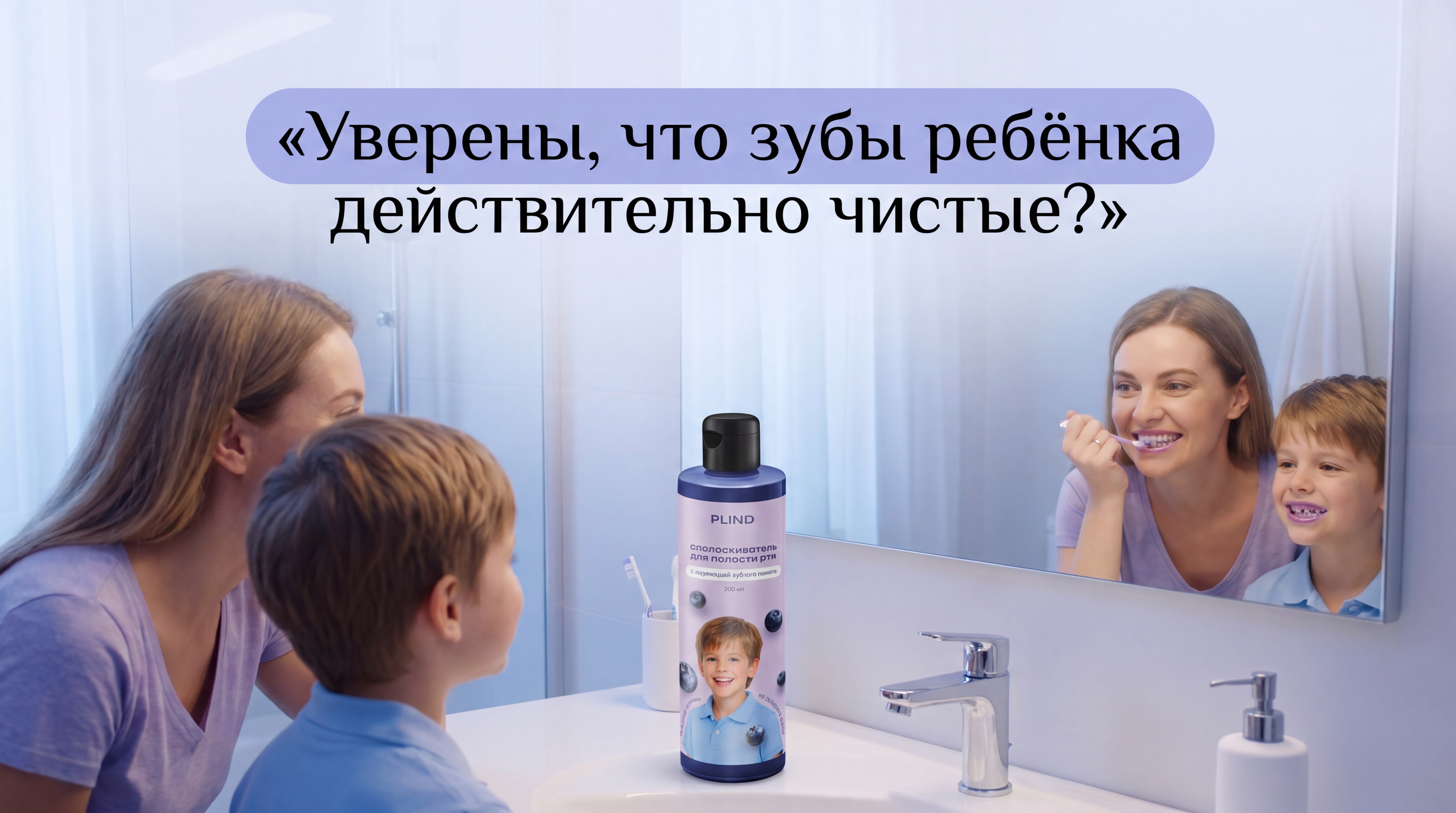
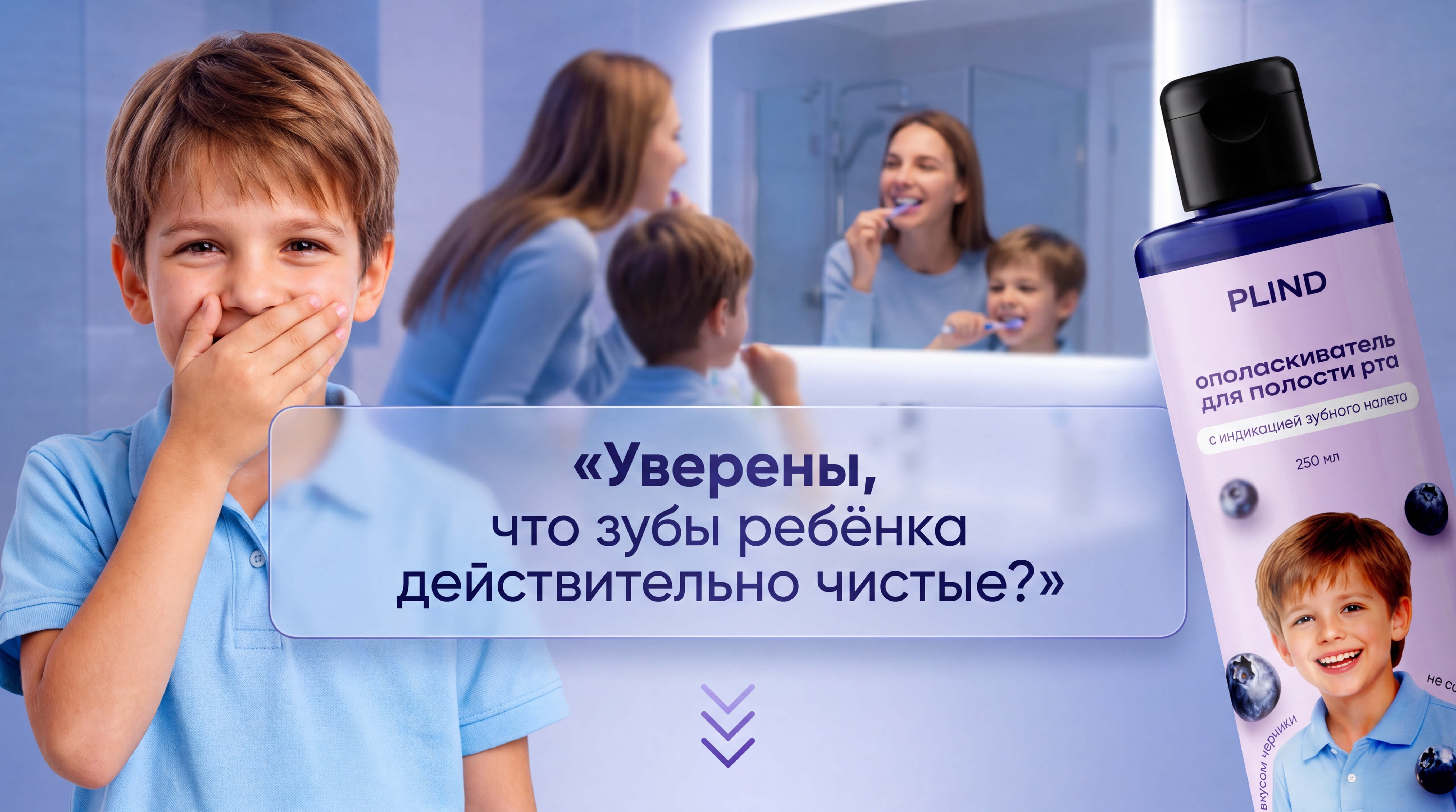
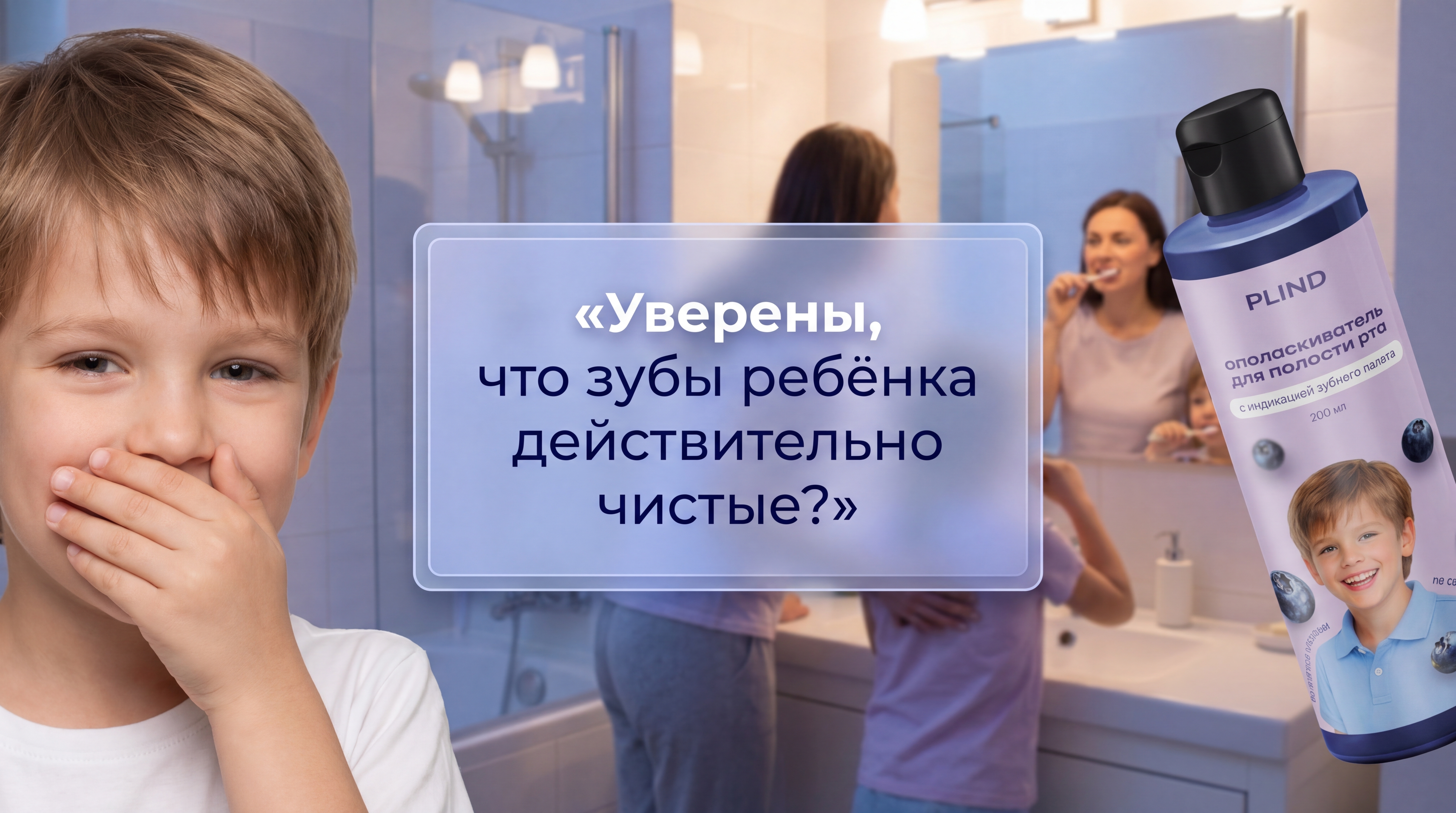
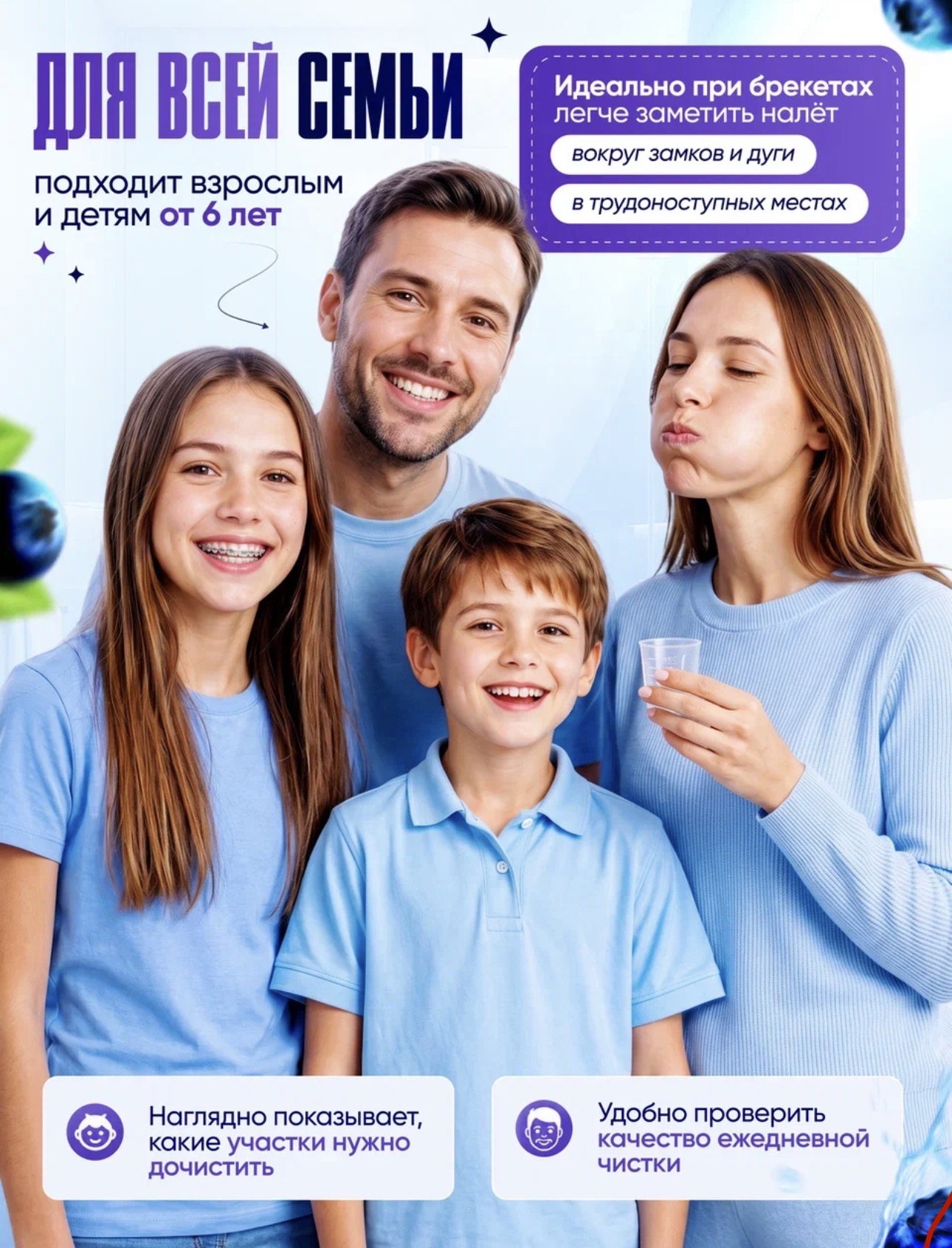
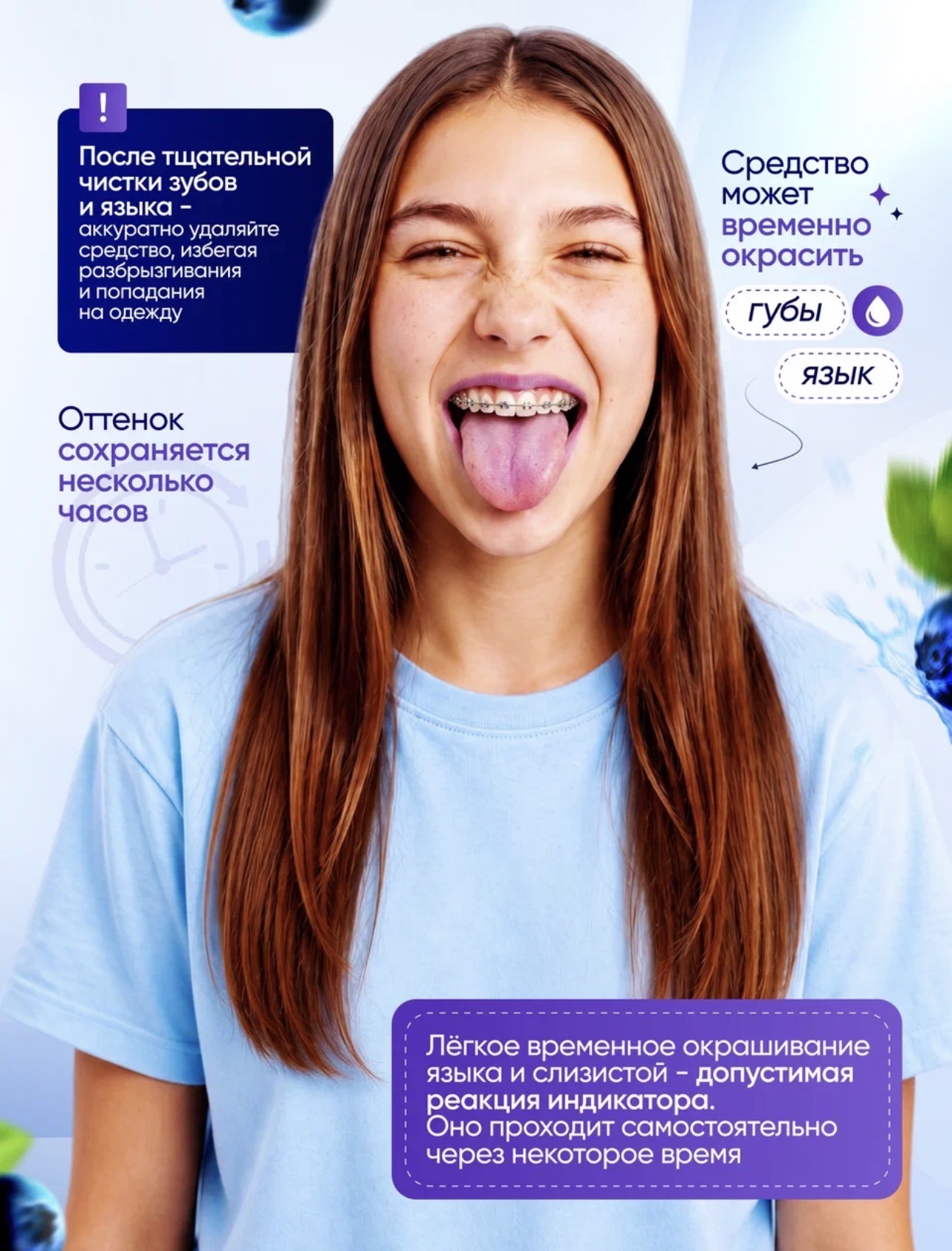
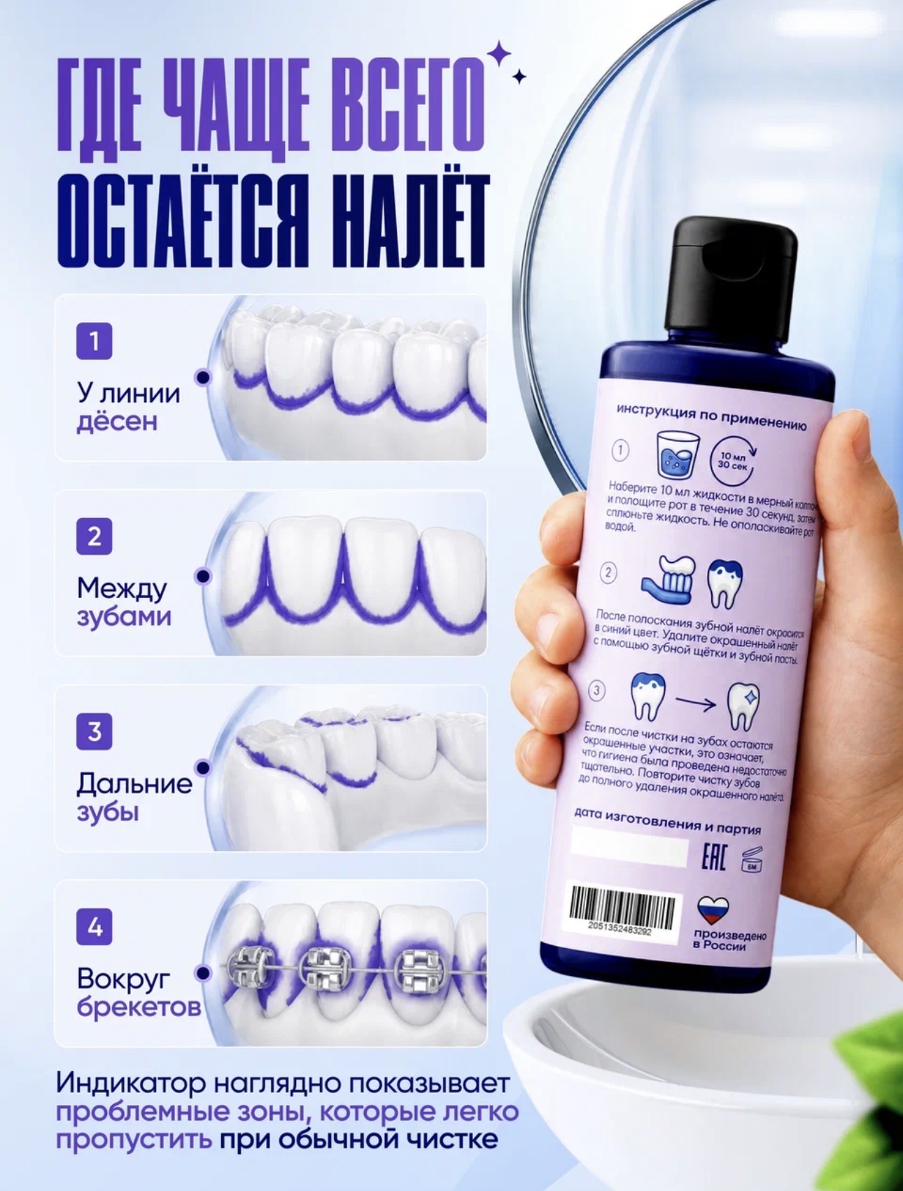
Use my attached source images as the main visual reference. Use the real PLIND mouth rinse bottle from my uploaded photos exactly as it is, without any changes to the bottle shape, cap, label design, colors, proportions, branding, or printed text. The product must stay identical to the original photo, sharp, clean, realistic, and clearly visible. Do not redesign, relabel, simplify, distort, duplicate, blur, or replace the product. Create a premium teaser first slide for a Russian marketplace rich content section. The purpose of this slide is to catch attention in the product card and make the buyer want to open the rich content tab. The design must be emotional and curiosity‑driven, not overloaded with information. Scene: modern bright family bathroom in soft evening light. A mother and her child stand near the sink and wide mirror, looking at their reflection with interest, as if checking how well they have brushed their teeth. The real PLIND bottle from my source images is placed in the scene, large, sharp and attractive, but not covering the main text. The overall atmosphere is calm, clean and family‑friendly. Match the visual style and color palette of my existing infographic: use the same or very close harmonizing colors — soft blue, violet, lavender, white and light cool gradients that fit naturally with the PLIND bottle. The new slide must look like part of the same visual series as my current infographics, not like a different brand. Place one single large central headline in Russian as the main focus, without extra small lines. The text must be exactly: «Уверены, что зубы ребёнка действительно чистые?» Center this headline horizontally and vertically in the safe central area of the banner, so it remains fully visible and readable even when only the middle third of the image is shown in the marketplace card. Use large, high‑contrast, elegant typography that is easy to read on a mobile screen. Behind the text, add a soft rounded highlight or subtle glow / pill‑shaped area in the same blue‑violet palette, so the phrase stands out like a premium brand message, but still feels gentle and not aggressive. Do not add a separate “Разверни” button and do not add any additional small text below — keep the message short, strong and clean. Style: photorealistic, premium family product advertising, soft blue and light violet palette consistent with my existing infographic, simple and uncluttered composition, no extra logos, no tiny text, mobile‑friendly layout focused on the central headline.
Free to start · Generate videos and images with AI in seconds
More from this creator
More L images
См. все →