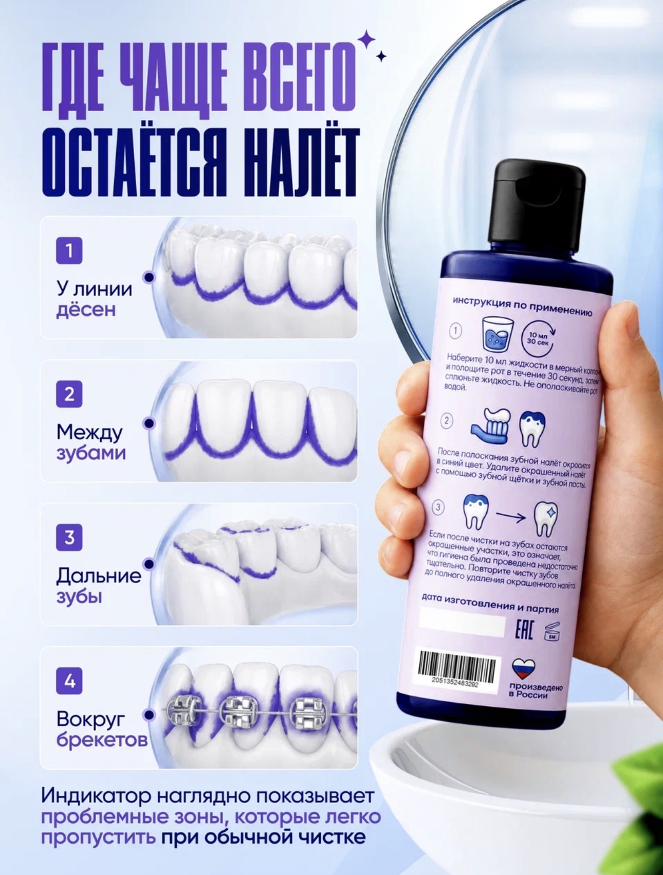
Image - 2026-05-23 18:03
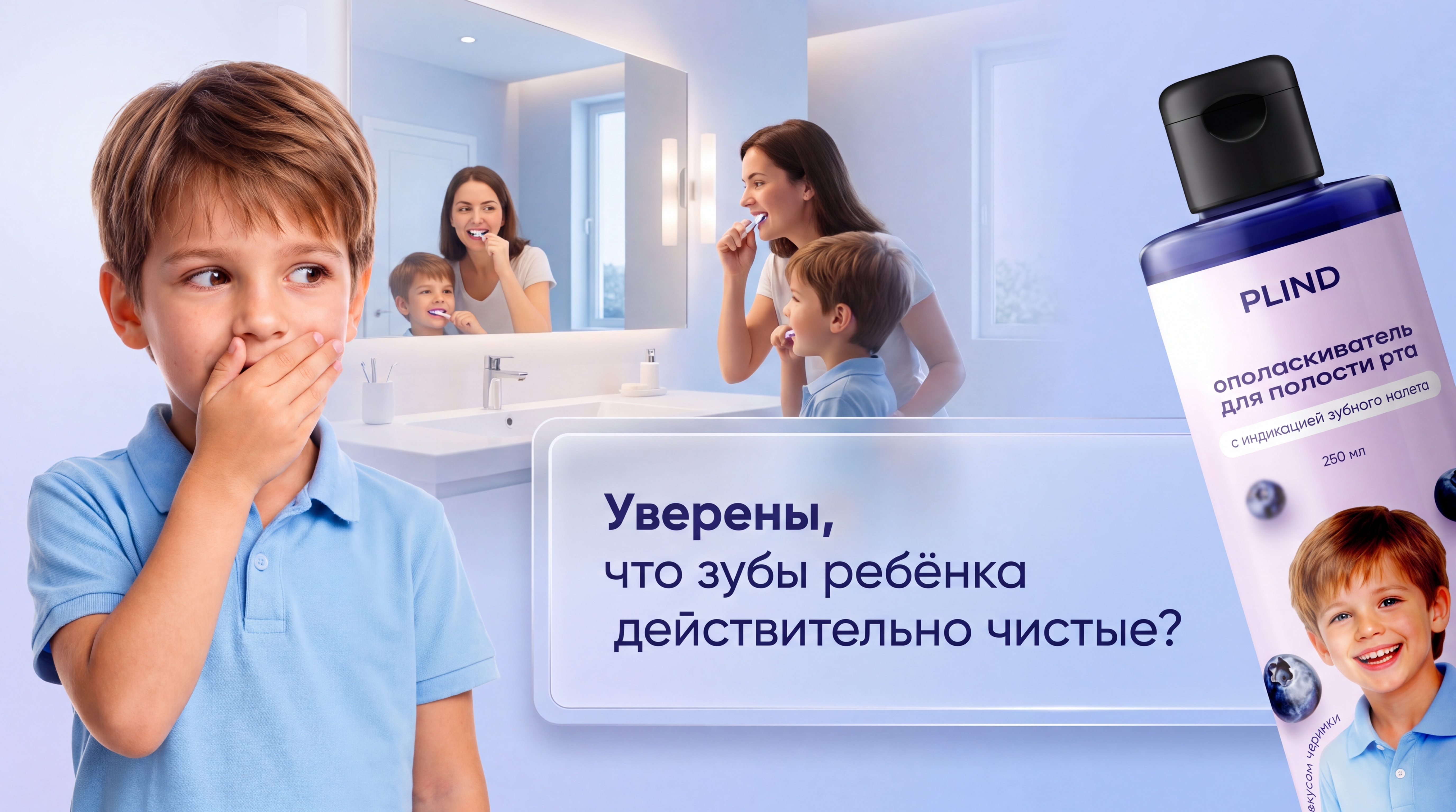
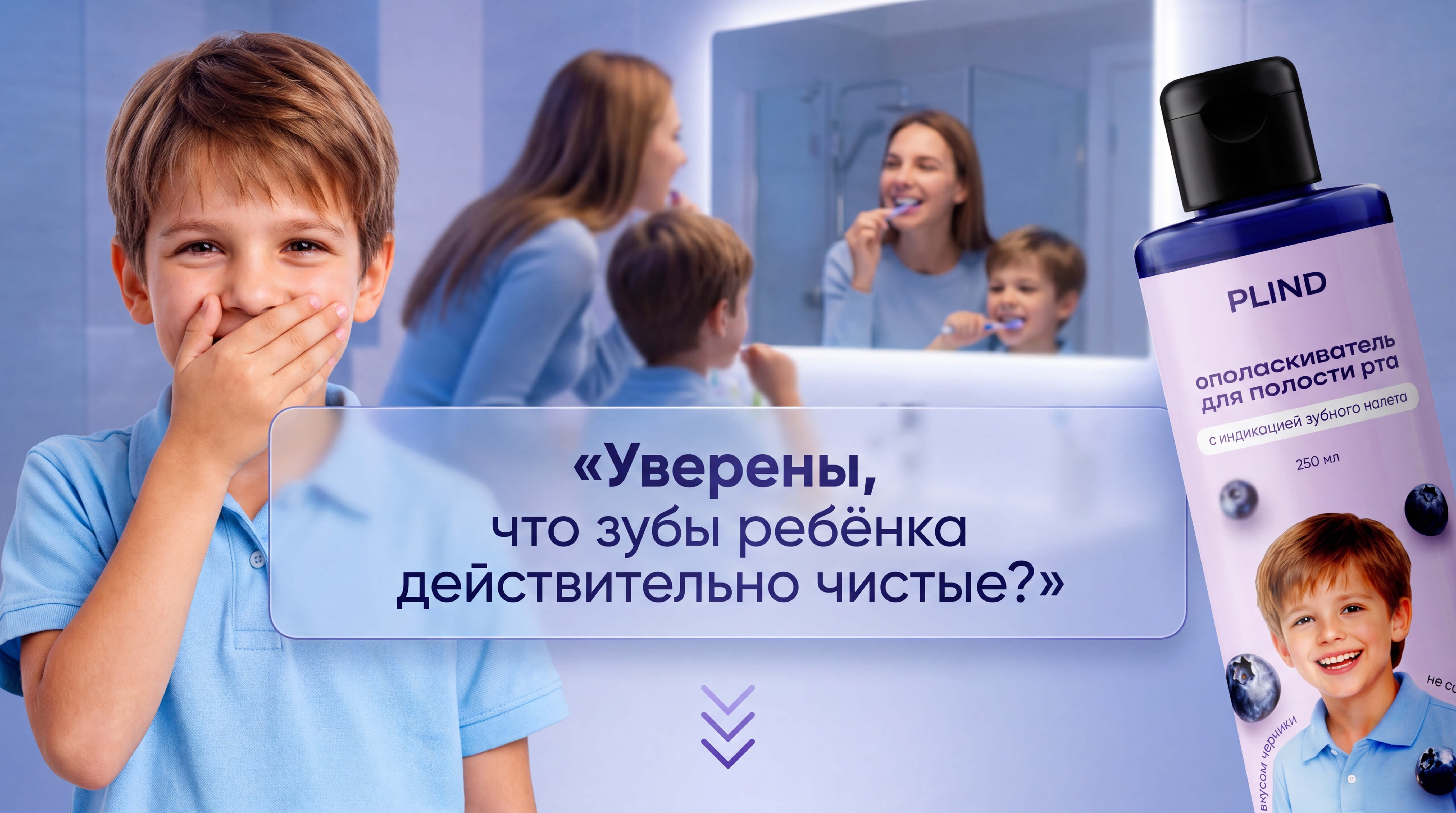
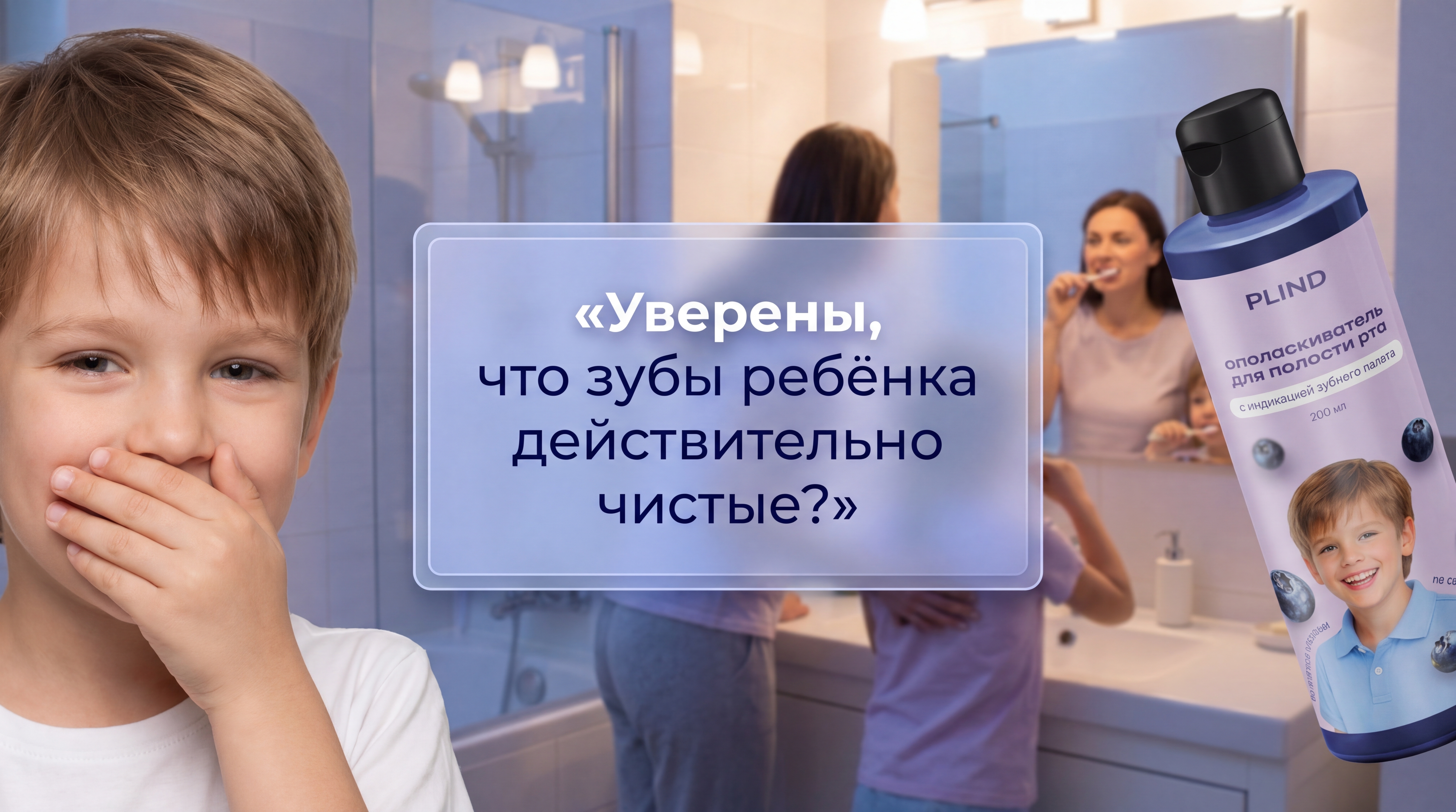
Use my attached source images as reference. Keep the real PLIND bottle exactly as in my photos (same label, colors, proportions, text), but you may show only part of the bottle, slightly zoomed and cropped from the right edge, at a natural three‑quarter angle, to make it look like a close‑up lifestyle shot, not a flat cutout. Create a premium teaser first slide for a Russian marketplace rich content section. Scene: modern bright family bathroom in soft evening light. In the background near the sink and mirror, show a mother and child checking their teeth. On the left side, closer to the viewer, place a larger child figure covering their mouth with one hand in a shy, playful way. The child should be clearly visible from chest up and big enough so the gesture is easy to read on a mobile screen. Place ONE main Russian headline in the central safe area of the banner, slightly closer to the center than to any edge, with enough empty space around it. Text: «Уверены, что зубы ребёнка действительно чистые?» Instead of a simple button, design the text highlight as a premium soft glassmorphism / semi‑transparent panel: subtle blue‑lavender tint, light inner glow, smooth corners, thin elegant border, and soft shadow, like a luxury brand tagline, not a cheap button. Use refined typography: slightly heavier weight for “Уверены” and balanced line spacing. The panel should be visually lighter than in previous versions and take no more than one third of the image height. On the right side, show a close‑up of the PLIND bottle: only part of the bottle enters the frame from the right, slightly enlarged, with realistic light and reflections, so it supports the message but does not dominate over the headline. Keep the overall color palette and mood consistent with my existing infographics: soft blue, violet, lavender, white, clean gradients, premium and calm, no extra small text, no additional logos. Move the glass text panel slightly lower so it sits just below the horizontal middle line of the image, with more free space above it and a bit less below. Reduce the vertical height of the panel by about 20%, keeping the text large and centered. Soften the glass effect: make the fill more transparent, reduce the outer glow, and use a very thin, elegant border instead of a strong bright outline, so it looks like a premium brand tagline, not a UI button. Make the child on the left slightly larger again and tilt the head or gaze a bit towards the headline, so the gesture of covering the mouth clearly connects with the question on the panel.
Free to start · Generate videos and images with AI in seconds
More from this creator
More L images
См. все →