Image - 2026-05-25 11:11
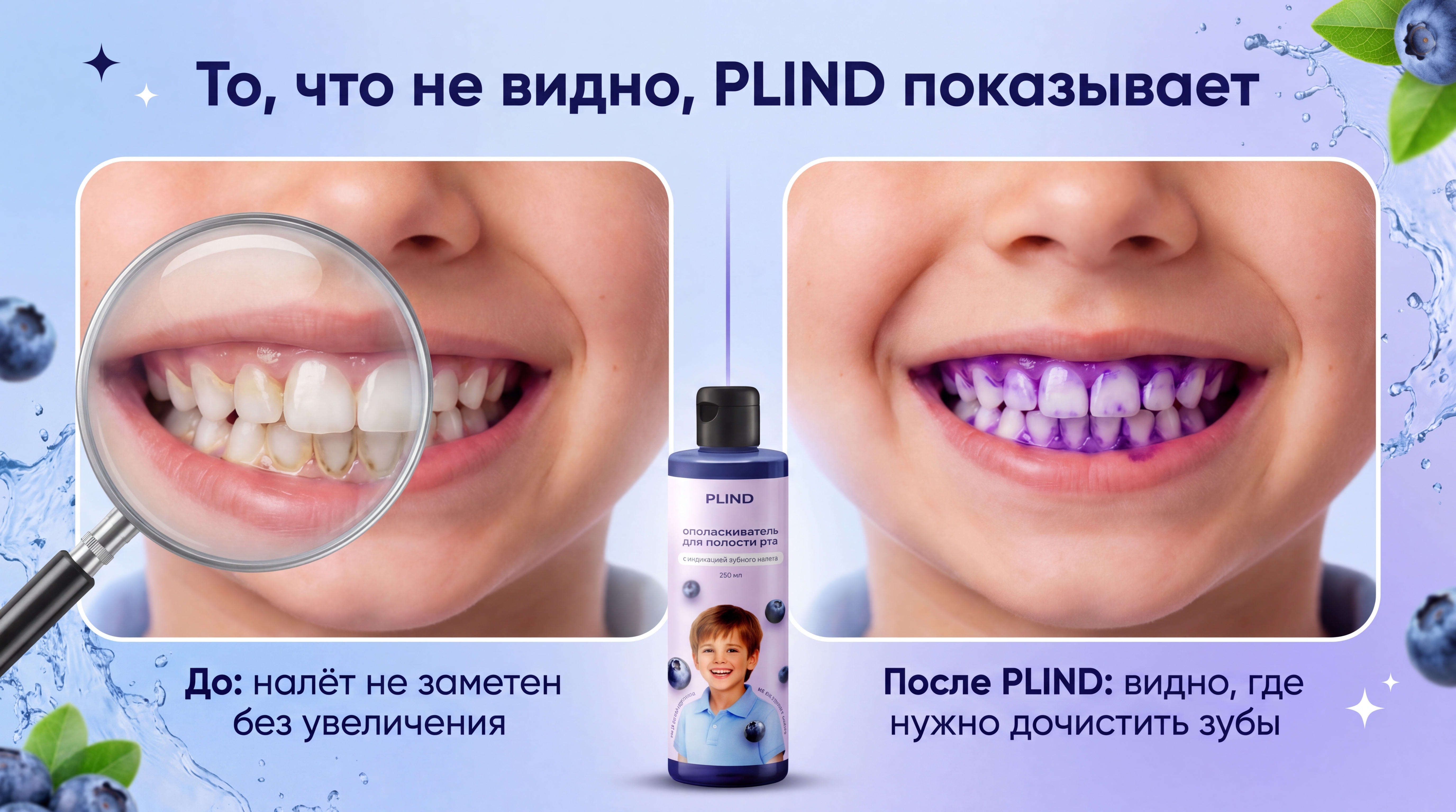
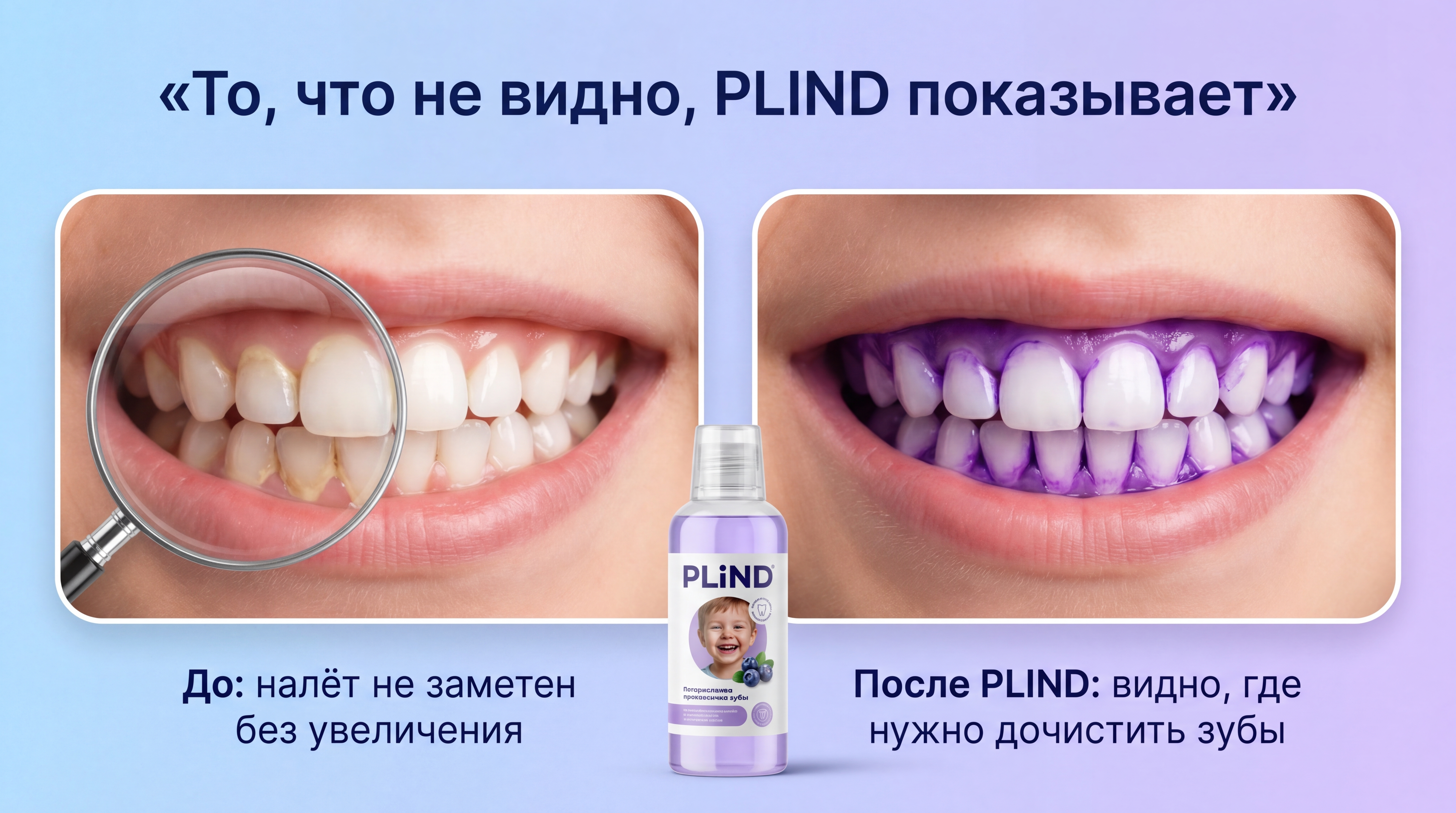
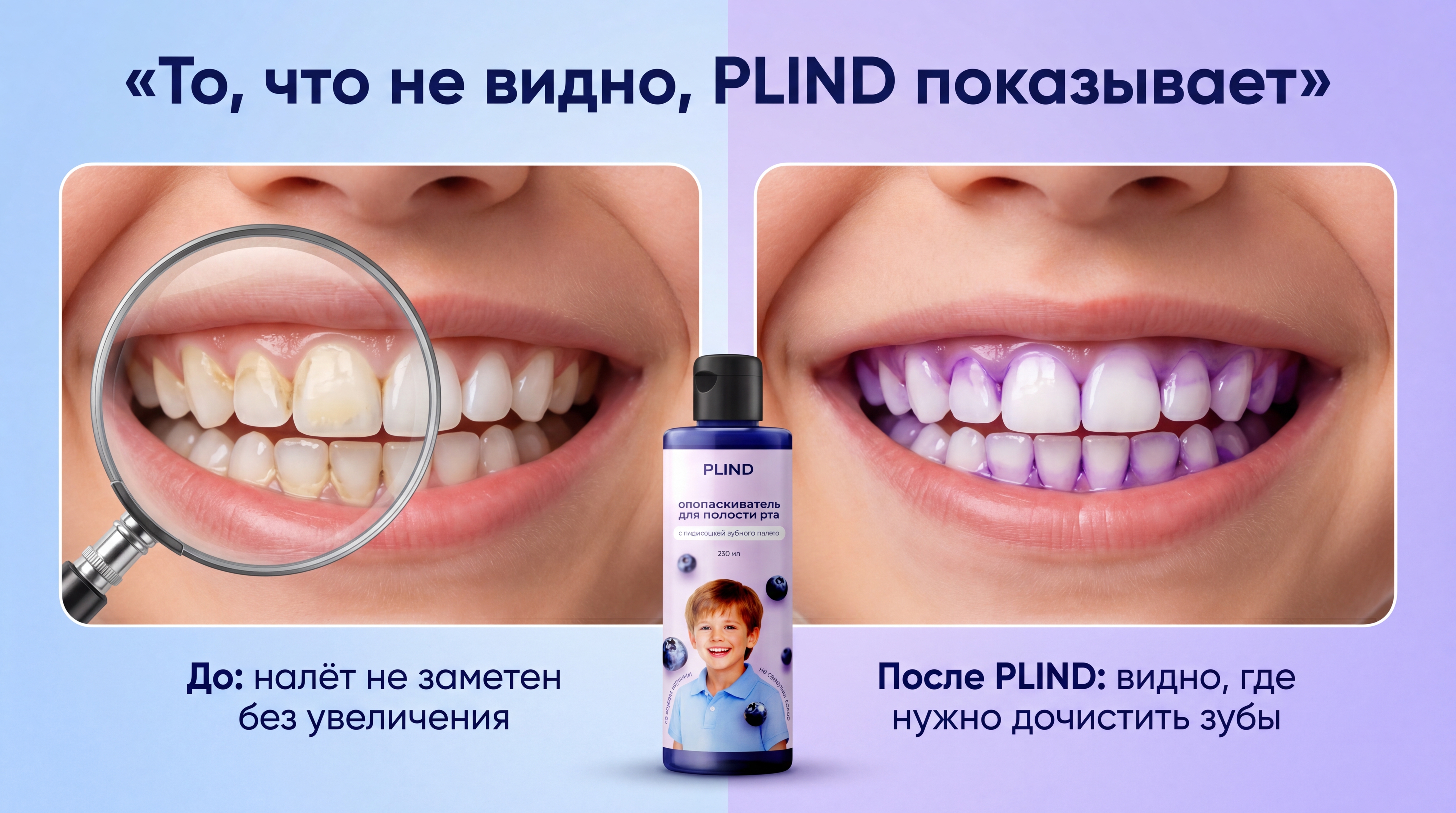
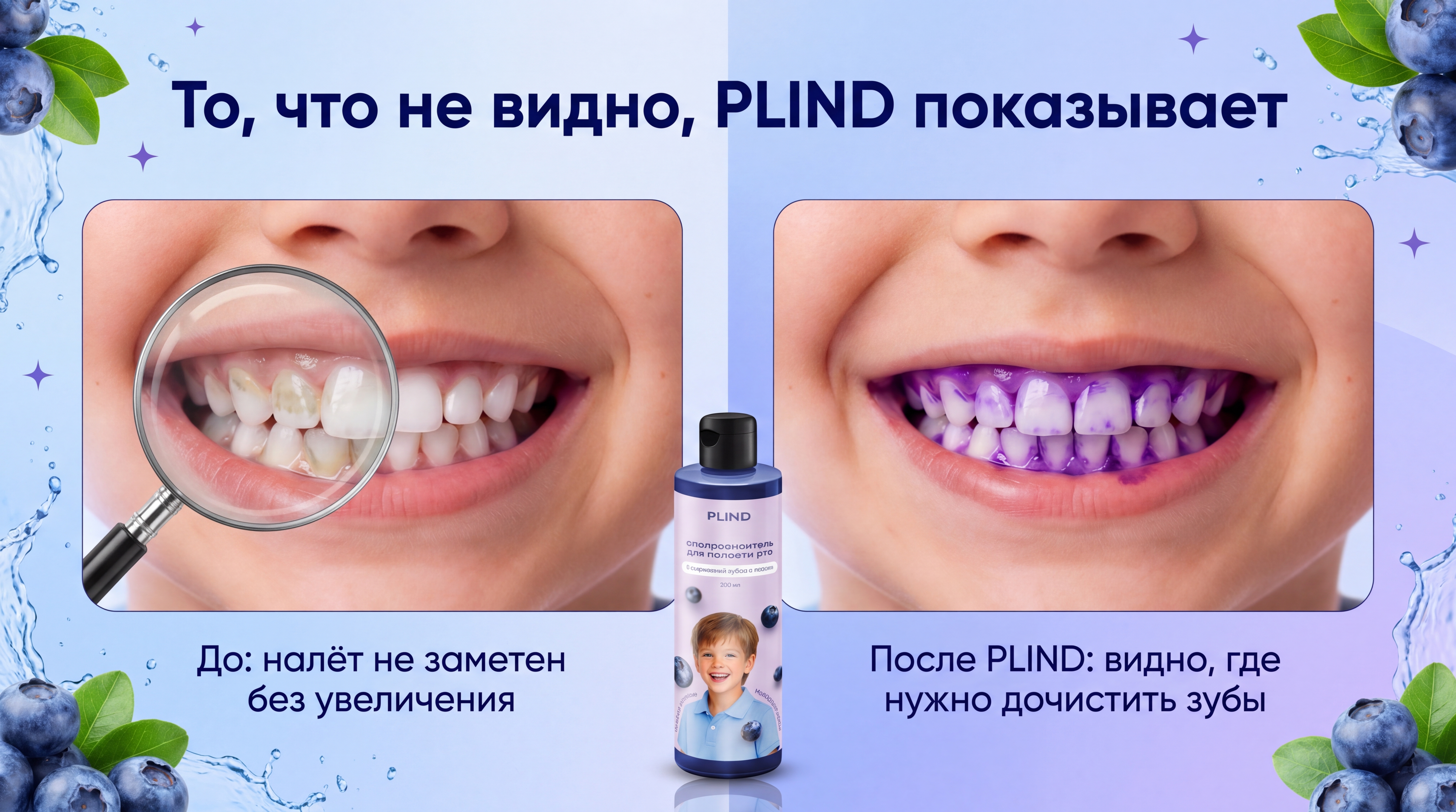
Use all my attached PLIND reference images as the main style guide. Match their visual style exactly: same blueberry theme, same water splashes, same soft blue‑violet gradient background, same fonts and general composition. Generate a brand‑new high‑resolution horizontal slide (16:9) for a Russian marketplace product page. Overall concept: a “before / after” comparison showing how PLIND reveals hidden plaque on children’s teeth. Background, theme and layout Background: reproduce the same type of soft blue‑to‑violet gradient and decorative elements as in my current PLIND infographics: subtle water splashes around the edges, blueberries and green leaves in the corners, small minimalistic decorative crosses or sparkles where appropriate. The feeling must be fresh, fruity and dental‑clean, but calm and premium. Layout: split the slide into two equal halves with a soft vertical gradient divider in the centre. Each half has a rounded‑corner rectangular frame for the child’s smile, just like in my reference slides. Text (Russian only) At the top, centre the headline in Russian, exactly as follows: «То, что не видно, PLIND показывает» Use the same font style, size and colour as in my existing slide (modern sans‑serif, dark blue, bold). Under the left image, align the caption as in the reference: «До: налёт не заметен без увеличения» Under the right image, align the caption as in the reference: «После PLIND: видно, где нужно дочистить зубы» Strict rules: Do not add any English words such as “BEFORE” or “AFTER”. Do not add any additional text, labels or icons. Keep the typography hierarchy identical to the reference: headline on top, captions under photos, nothing else. PLIND bottle (centre bottom, must match reference photo) Place the PLIND bottle at the bottom centre, slightly overlapping the split between the two halves. The bottle must match my real PLIND bottle reference photo as closely as possible: same overall shape (tall, relatively slim, rounded shoulders), same transparent walls with light violet liquid inside, same cap shape and colour, same label design: brand name “PLIND” in dark blue on a white background, blueberries image, child portrait, Russian text about mouth rinse. Strictly do not redesign or invent a new bottle. Do not change label layout, do not change cap type, do not simplify or stylise it. It must look like a realistic product photo placed into the composition. The bottle should cast a soft, realistic shadow on the background. LEFT SIDE – BEFORE (natural yellow‑beige plaque under magnifying glass) Goal: show that to the naked eye the teeth look clean, but under a magnifying glass you can clearly see natural plaque. Show a close‑up of a child’s smile (no eyes), similar age and look as in my references: slightly turned to the right, lips parted, upper and lower front teeth visible, healthy gums, natural lip colour. Lighting: soft, neutral, matching the reference slides. Magnifying glass: Place a realistic circular magnifying glass over the left half of the visible teeth (from viewer’s perspective). The handle goes downwards to the left, partially outside the frame. Ensure that the right half of the teeth is completely outside the magnifying glass and fully visible. Teeth outside the magnifying glass: All teeth outside the magnifying glass must look perfectly clean and white, with no visible plaque or stains. Enamel should be natural white with a slight warm ivory tint, glossy and healthy. To the viewer, without looking into the magnifying glass, the smile must appear well‑brushed and healthy. Teeth inside the magnifying glass: Show real, not dyed dental plaque only under the magnifying glass. Strict rules: do not use any violet, purple or blue colours inside the magnifying glass, do not use bright neon colours. Plaque colour: natural yellowish, beige and slightly grey tones, like soft plaque and early tartar along the gumline and in interdental areas. Place plaque mainly: along the gumline of the upper and lower front teeth, between teeth in contact points, in small pits and grooves. Do not cover entire teeth with plaque. The majority of the enamel must remain visible as white, with plaque appearing as semi‑transparent films and irregular patches on top. The magnifying glass must enlarge the teeth slightly and make plaque sharply visible and detailed, emphasising that this is something you only see with magnification. RIGHT SIDE – AFTER (violet indicator on plaque, not on gums) Goal: show how PLIND colours the plaque in violet, making all problem areas obvious. Show the same child’s smile from a very similar angle as on the left side, so it clearly feels like “before/after” of one person. Teeth shape and alignment must be consistent between left and right. Plaque staining: Apply a dental plaque disclosing indicator in violet / lilac tones. Strict rules: colour only the plaque on the tooth surfaces, not the gums or soft tissues, avoid covering the whole crown of each tooth; focus on real plaque zones. Main zones of staining: along the gumline (cervical area) of each tooth, between teeth in contact points, in pits and grooves where plaque usually accumulates. The violet indicator should form a continuous but slightly translucent layer on these plaque areas, similar to how real disclosing solutions work. Clean enamel where there is no plaque must remain mostly white/ivory, with clear glossy reflections, creating strong contrast between white enamel and violet plaque. Avoid thick, cartoonish outlines or blobs of colour on the gums. The stain should sit precisely on the plaque films on the enamel. Make sure the pattern of violet staining corresponds logically to the plaque pattern seen under the magnifying glass on the left side (gumline and interdental zones). Global style and constraints Overall style: photorealistic, premium dental advertising for parents and children, friendly and trustworthy. Do not add cartoon bacteria, mascots, characters or emoticons. Do not distort facial proportions or make the smile look scary or diseased; plaque and staining should be clearly visible but not grotesque. Respect the colour palette of the PLIND brand in the references: soft blues, violets, lavender tones, fresh green leaves, natural blueberry colours. The key story must be crystal clear visually: left: to the eye, teeth look clean, but magnification reveals natural yellow‑beige plaque, right: after PLIND, that same plaque is coloured violet on the teeth, showing exactly where a child needs to brush better.

Free to start · Generate videos and images with AI in seconds
More from this creator
More L images
См. все →