

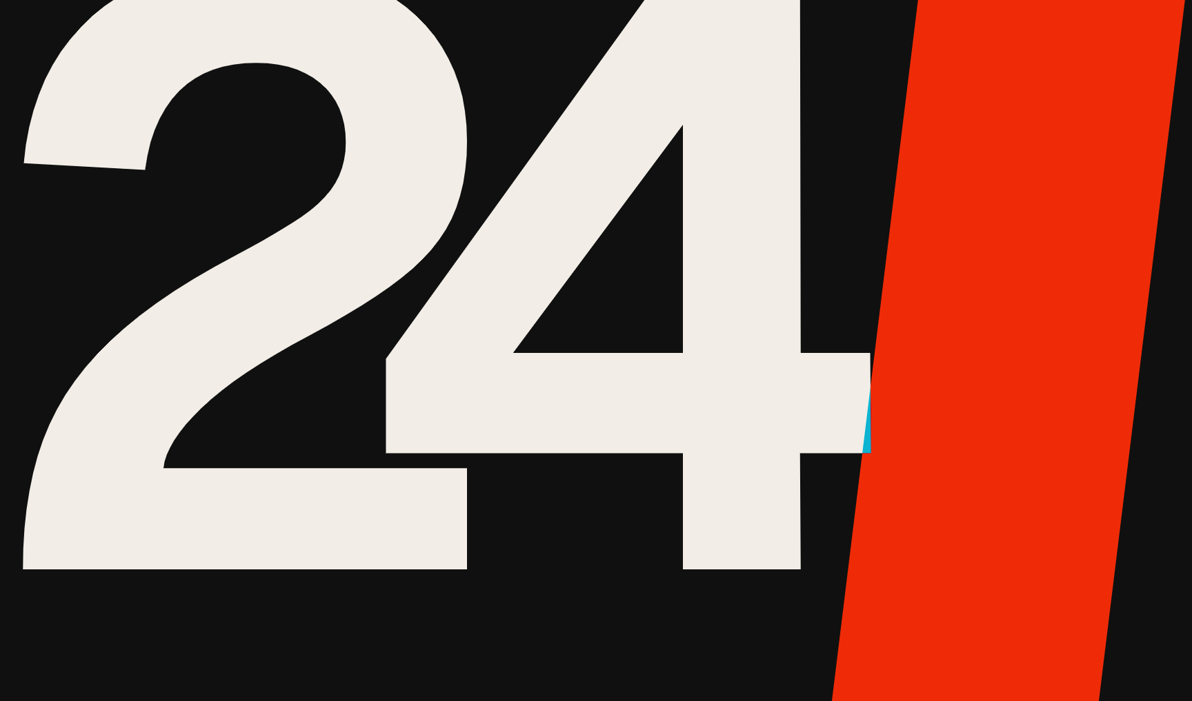
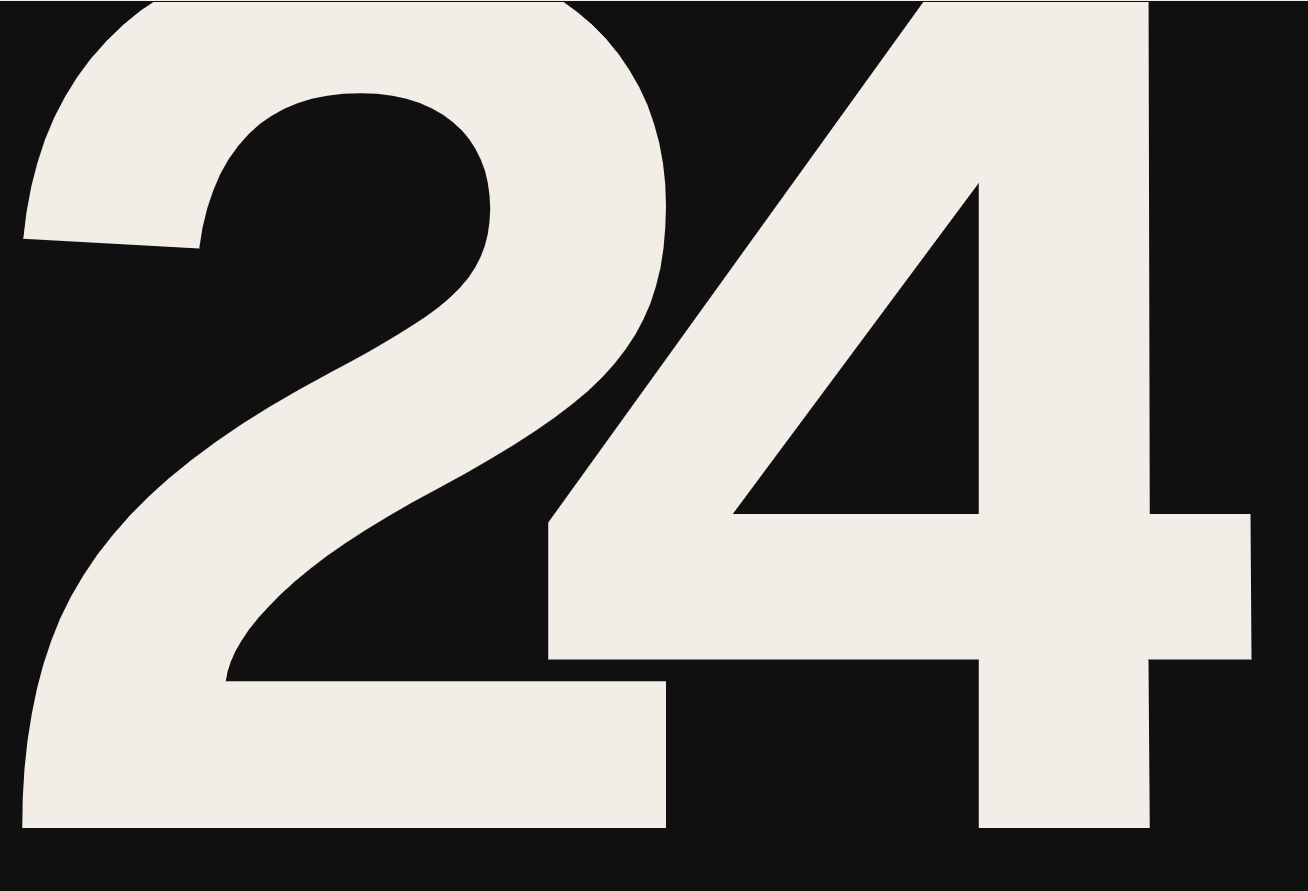








Use the two attached reference images as the main visual basis. Redraw the logo in the same bold geometric spirit, carefully preserving the overall character, proportions, and visual weight of the referenced “24”, but render it as a clean, polished, finished logo. Important style characteristics taken from the references: very bold, massive, graphic numeral construction; the number “2” should be wide and heavy, with a large rounded upper counter, a strong sweeping body, and a long stable bottom base; the number “4” should be large, angular, and blocky, with a strong vertical stem, a large triangular inner counter, and a thick horizontal crossbar; the whole mark should feel modern, sharp, bold, and highly recognizable; not elegant serif typography, not Roman inscription style, not thin premium lettering — this should look more like a strong graphic identity mark; clean edges, vector-like precision, solid silhouette, no texture, no mockup look. Render the “24” in a light warm gray / soft off-white color, close to a slightly warm ivory tone, on a pure black background. No extra graphics, no red stripe, no additional shapes, no shadows, no gradients, no decorative effects. The logo should be centered and large in the frame, with strong visual impact and minimal empty space. Create a clean final logo presentation image.
Free to start · Generate videos and images with AI in seconds