Image - 2026-08-24 13:03
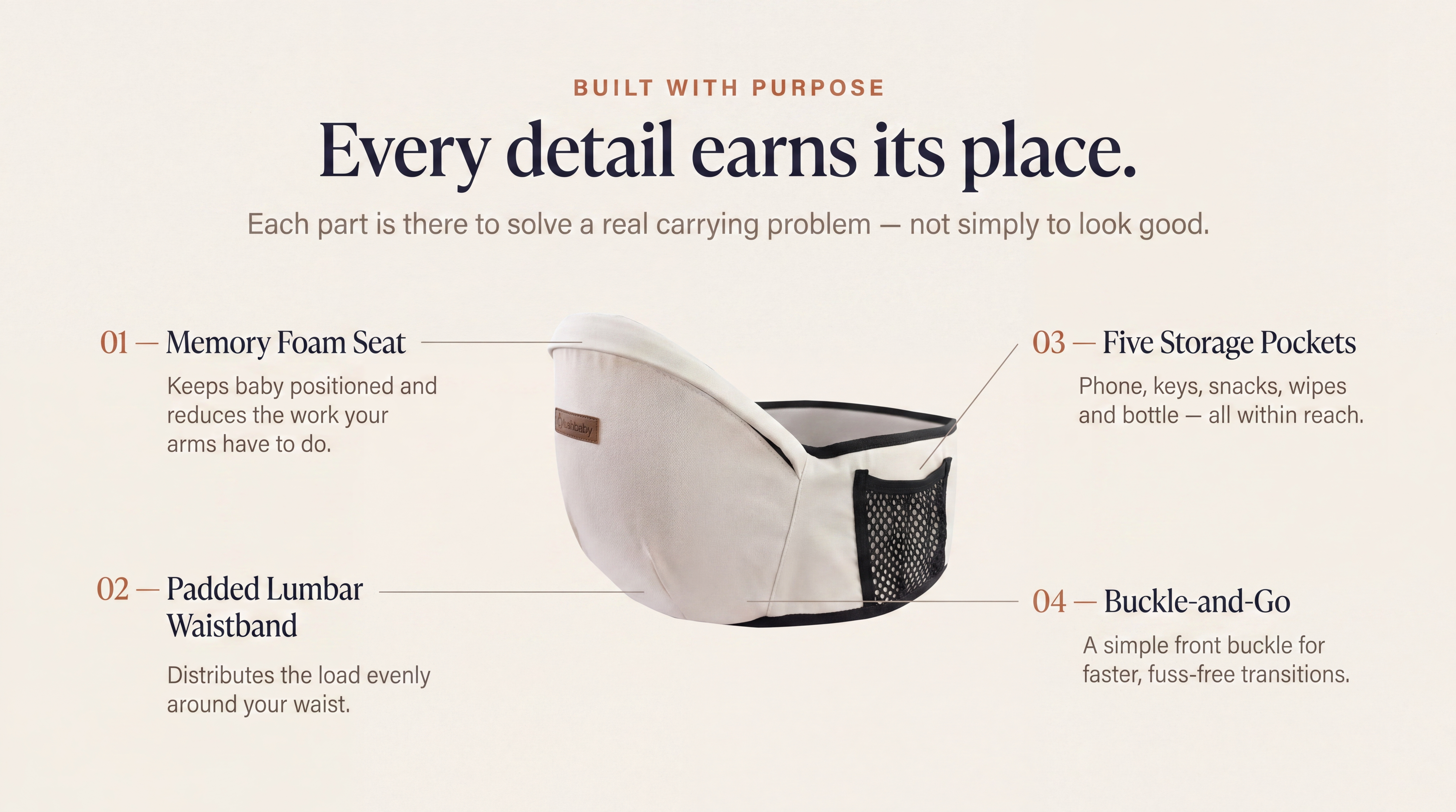
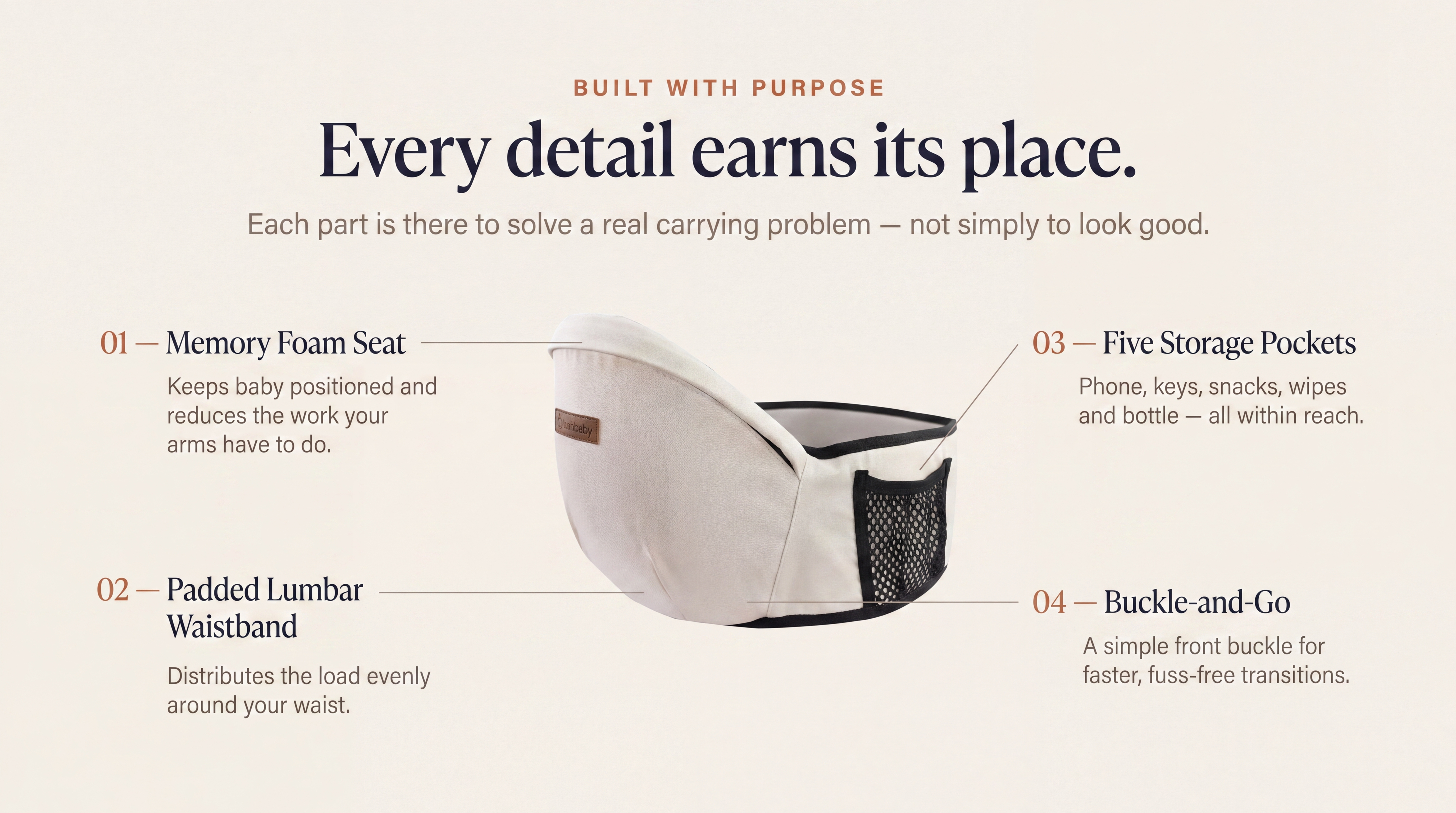
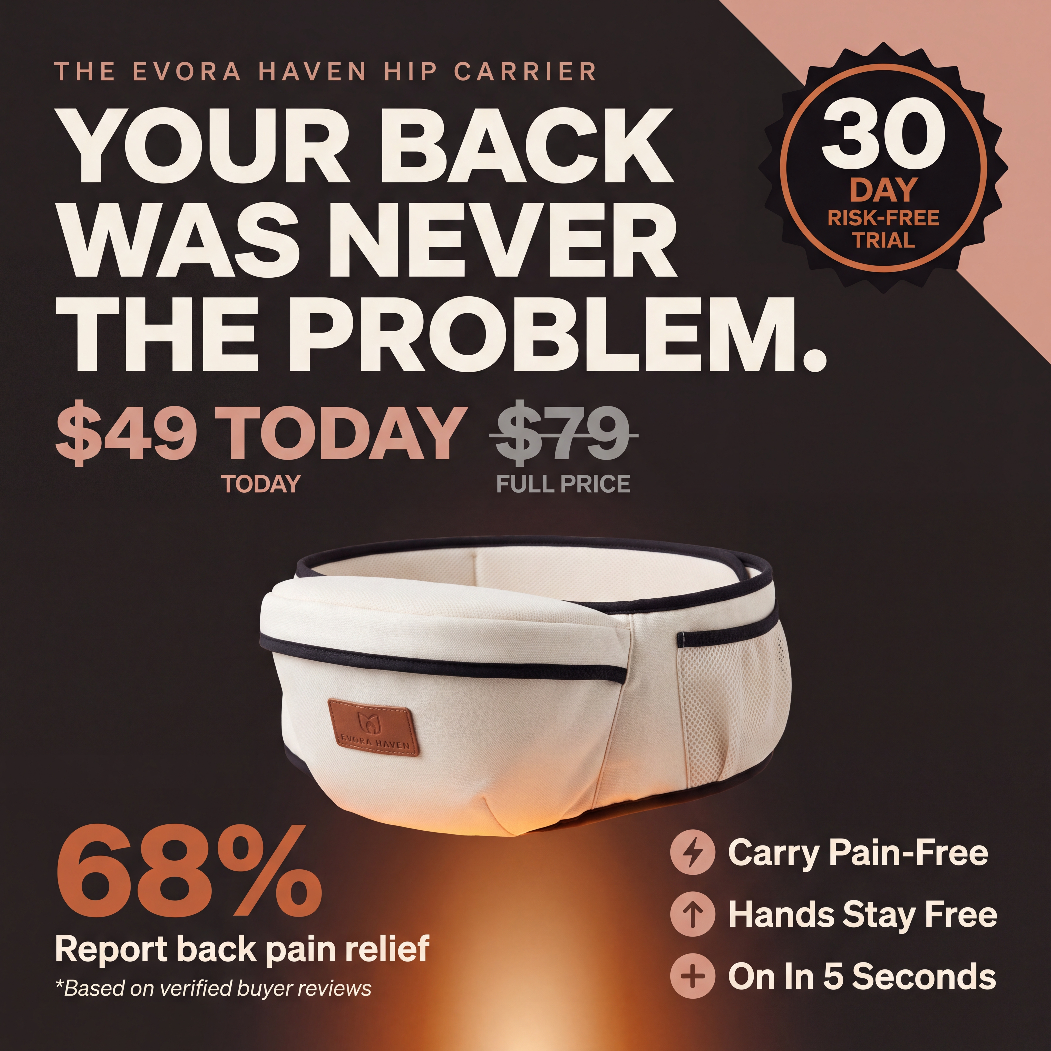
Create a high-end product feature graphic for a premium baby hip carrier brand called Tushbaby. This is a Shopify website section banner, so the final image must be 1440px wide × 800px tall (16:9 landscape, retina-ready). OVERALL STYLE & MOOD Luxury minimalist. Think Aesop meets baby wellness. Clean, editorial, premium. No clutter. Generous white space. The graphic should feel like it belongs on a Scandinavian lifestyle brand's website — warm, trustworthy, and refined. BACKGROUND Solid warm off-white cream — hex approximately #EDEAE4 (a greige/linen tone, not pure white). Subtle linen-paper texture is acceptable but must be very faint. No gradients, no patterns. LAYOUT STRUCTURE The product photo of the Hip Carrier sits centered in the image. Around the product, four feature callout annotations radiate outward — two on the left side, two on the right side — connected to specific parts of the carrier using thin, elegant hairline connector lines (approximately 0.5–1px, color: #C4BDB5 warm gray). Each callout has a small numbered label and a short feature title + one-line description. There should be ample breathing room between elements — nothing feels crowded. TYPOGRAPHY Section eyebrow label at the very top center: the words BUILT WITH PURPOSE in all caps, wide letter-spacing (tracking: 0.25em), small size (~11px equivalent), color #B5714A (muted terracotta/rust) Main headline below the eyebrow: "Every detail earns its place." — large serif font (think Cormorant Garamond or Playfair Display style), approximately 52–60px, color #1F1F2E (deep navy-charcoal) Subheadline below main headline: "Each part is there to solve a real carrying problem — not simply to look good." — light weight sans-serif, approximately 16px, color #8A8078 (warm medium gray) Feature numbers (01, 02, 03, 04): same terracotta #B5714A, small (~11px), all caps, spaced tracking Feature titles: serif medium weight, approximately 18–20px, color #1F1F2E Feature descriptions: light sans-serif, approximately 14px, color #8A8078, max 1–2 lines FOUR FEATURE CALLOUTS Position these around the product image. Each has a hairline line extending from the product to the callout text block. LEFT SIDE (pointing to the seat and waistband area of the carrier): 01 — Memory Foam Seat | "Keeps baby positioned and reduces the work your arms have to do." 02 — Padded Lumbar Waistband | "Distributes the load evenly around your waist." RIGHT SIDE (pointing to pocket area and buckle): 03 — Five Storage Pockets | "Phone, keys, snacks, wipes and bottle — all within reach." 04 — Buckle-and-Go | "A simple front buckle for faster, fuss-free transitions." PRODUCT PHOTO TREATMENT The carrier photo should appear life-sized and realistic in the center of the image — not illustrated, not with drop shadow, not floating on a white cutout card. Use a clean product shot on transparent/removed background so the carrier sits naturally on the cream background. The carrier should occupy approximately 35–40% of the total image width. If possible, show the carrier from a front-facing or slight three-quarter angle so multiple features are visible simultaneously. CONNECTOR LINES Thin hairlines (not arrows — just straight or gently curved lines) in #C4BDB5 connecting each feature label to the relevant part of the carrier. Lines should feel architectural and precise, not hand-drawn. DO NOT INCLUDE Bright colors, gradients, or loud backgrounds Drop shadows on text Icons or emoji Any call-to-action button Cluttered or overlapping elements Any font that looks like a system default (no Arial, Helvetica, Times New Roman) FINAL CHECK The finished graphic should look like it was designed by a high-end DTC brand agency. Someone scrolling the evora haven website should feel the same elevated, minimal warmth they see in the rest of the site. The product should be the hero; the callouts should feel like editorial annotations, not promotional bullet points.
Free to start · Generate videos and images with AI in seconds
More from this creator
More L images
См. все →