Image - 2026-09-29 14:55
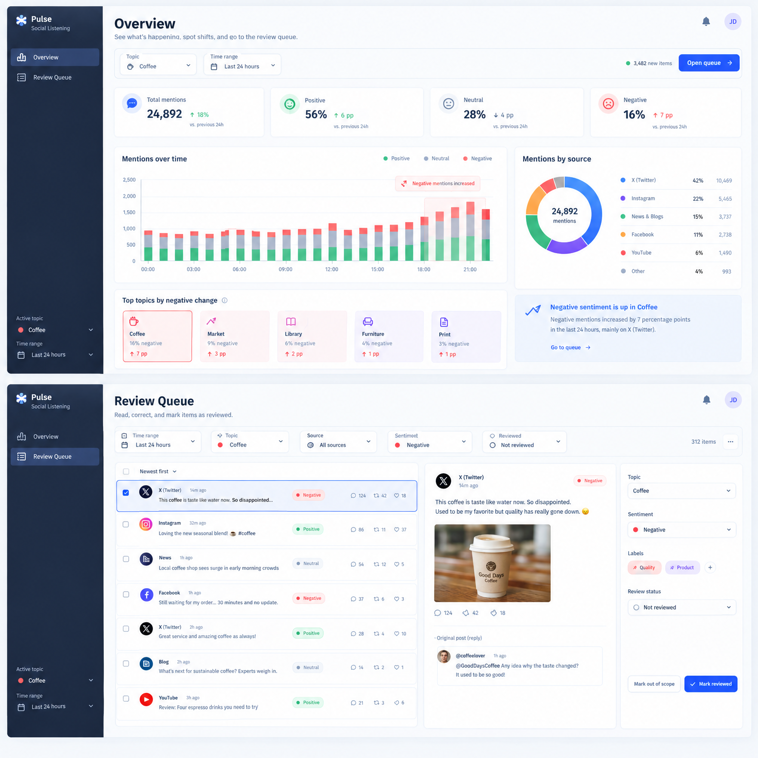
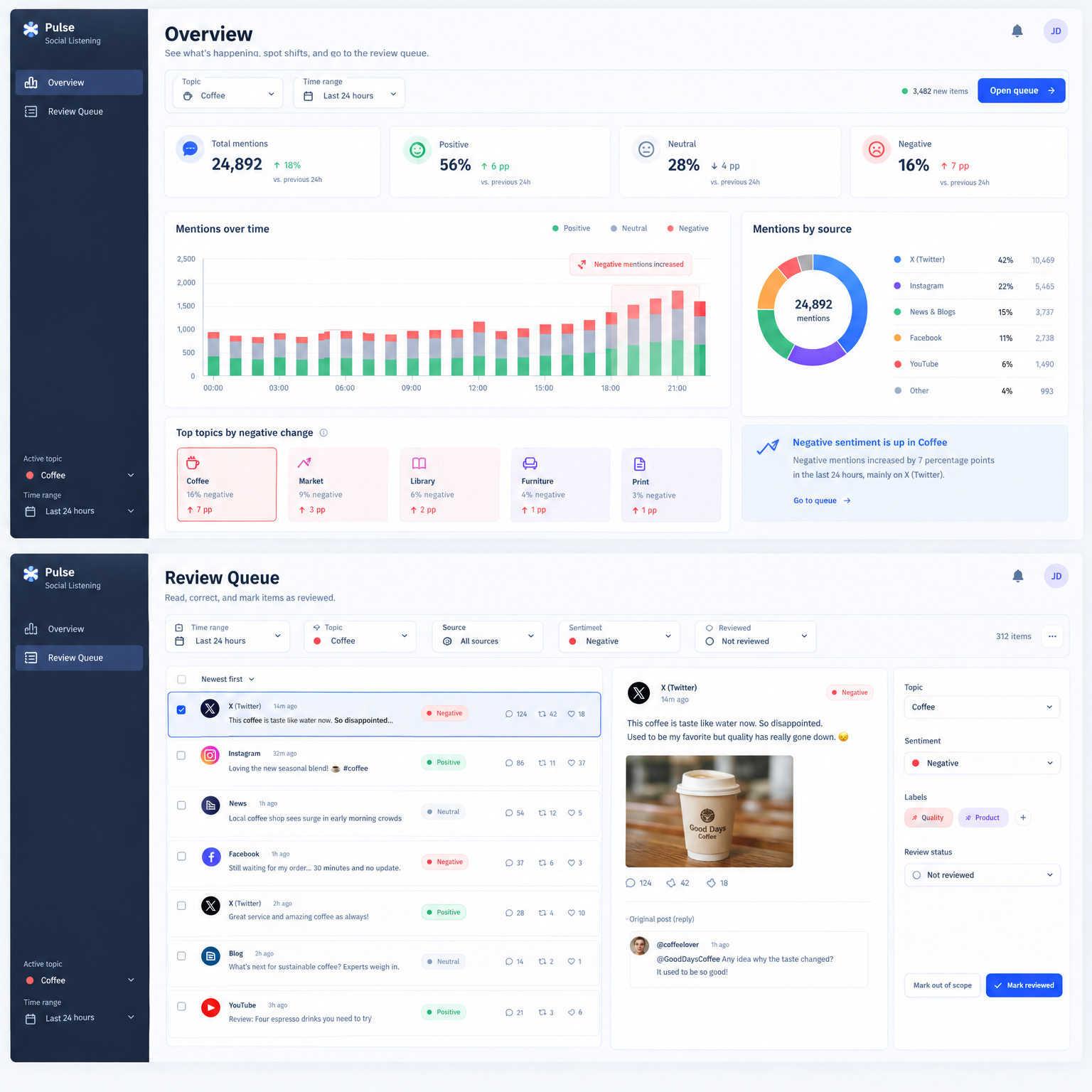
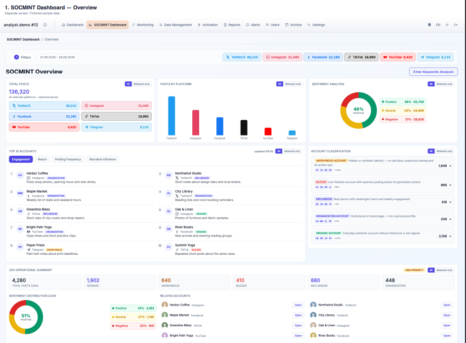
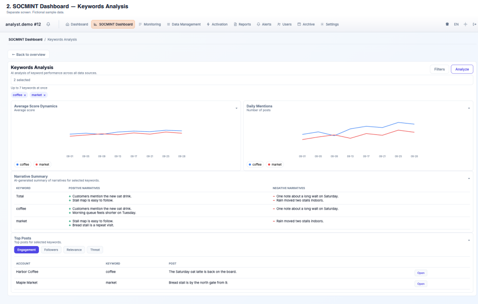
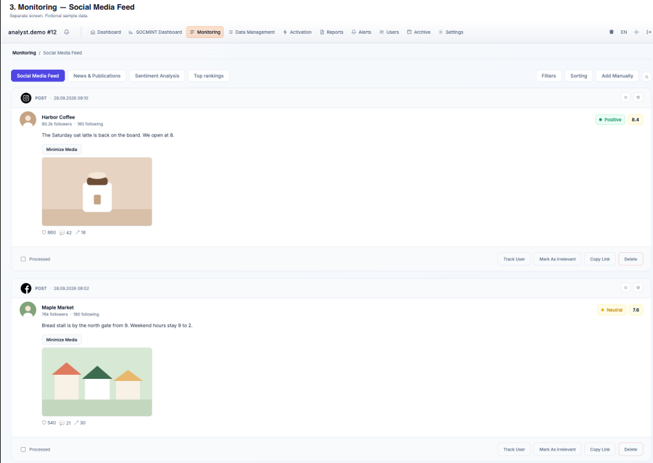
Describe the project for which the interface design needs to be developed: A social media analytics platform for a communications team. The contest task is two desktop screens only: the Overview and the Review Queue. The attached files show the current product as a reference. Nothing in it needs to be kept: layout, placement, colors, and elements can all change. Description of products/services: The product collects public posts and news, labels them, and helps a team see what changed and review new items. Administrators define topic areas and search terms. Analysts work from an overview into a queue of items they can read, correct, and mark reviewed. Use fictional sample data only. Target audience profile: Communications and brand teams that need a clear picture of public conversation, including outside office hours. Users are desk analysts on a shift. They handle high volume and must hand a clear picture to someone who will not open the tool. Existing or intended positioning: A professional listening workspace. The design should support one daily loop: notice a shift, then review the items behind it. It is not a publishing, community, or advertising tool. Main competitors: Established social listening suites used by communications teams, such as Brandwatch, Meltwater, Talkwalker, Sprinklr, and similar dashboard tools. Main competitive advantages: One filter set shared by the overview and the queue. Labels a team can correct, including subject, emotion, and reviewed status, not only positive or negative sentiment. Topic-level access so several teams can share one deployment. Project's target audience – who will use it and for what purpose: Analyst. Starts a shift on the Overview, then reviews new posts and articles in the Queue. Admin or team lead. Sets topic areas and search terms. They are not a separate screen in this contest. The analyst view should still make the active topic and time range obvious. Main functions of the interface: Design only these two screens. Overview. The first screen of a shift. Show the active topic and time range, a short summary of volume and sentiment, change over time, a breakdown by source, and a clear way to open the Queue with that same topic and time range already applied. Review Queue. The reading screen. Show filters for time range, topic, source, sentiment, and reviewed or not reviewed. Each row needs a text preview, source, time, sentiment, and engagement. One item stays open on the same screen, with full text, media, the original post when the item is a reply, and actions to mark it reviewed, mark it out of scope, and correct the sentiment or topic. Brief scenario of user interaction with the interface: An analyst opens the Overview and sees a rise in negative posts in one topic over the last day. They open the Queue, already filtered to that topic, that day, and items not yet reviewed. They read one post, correct a label, and mark it reviewed. Should visual images or characters be used in the interface design? If so, describe them. No mascots or characters. Photos in posts are evidence and stay inside the item. Use a quiet professional layout. Topic colors are the only strong color coding. Interface language: One primary interface language. Leave room for longer translations and for both left-to-right and right-to-left text. Posts may appear in other languages than the interface. Provide any additional information you consider important. Submit exactly two desktop screens, plus a note of up to 150 words on the main layout choice. The Overview should show a visible rise in negative posts, and the Queue should open on that same slice. Entries will be compared on how obvious the path from Overview to Queue is, how readable the queue is at high volume, and whether both screens include the required information and feel like one product. Do not design settings, reports, tables, an assistant, or any other screen. Those will not be reviewed. The attached screens show the current product only as a reference. Nothing in them needs to be kept: layout, placement, color, and individual elements can all change. We are looking for a full rethink of the front end.
Free to start · Generate videos and images with AI in seconds
More from this creator

More Gpt Image 2.5 images
См. все →